

01
UX Strategy & Research
User flows, information architecture, persona definition (casual player vs. advanced trader), competitive analysis, heuristic evaluation.
22 years simplifying complex systems — from Web3 marketplaces to mobile games. Bridging blockchain complexity into intuitive UX.
I'm a Senior Product Designer with 22 years of experience — started in 2004 with a non-stop journey across Press, Editorial, Web, Gaming, and Mobile. I've worked on-site for major companies and remotely with startups, as well as a freelancer across LATAM, USA, and Israel.
In recent years I've focused on UX/UI for Mobile, Product, and Gaming, and expanded into Web3 — most recently at Big Time Studios / OpenLoot, bridging blockchain infrastructure and intuitive marketplace UX. As a former Creative Leader, I've managed multidisciplinary teams of up to 12, optimizing workflows that directly drive business growth.
Based in Buenos Aires, Argentina · UBA graduate · Available for remote freelance and full-time opportunities worldwide.
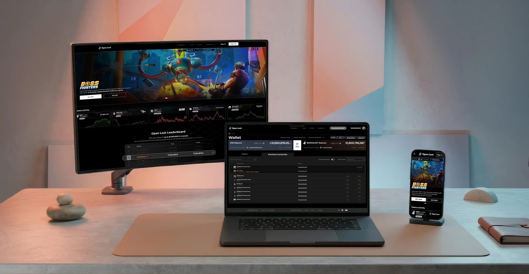
Award-winning Web3 NFT marketplace — design lead from 0 to 1M+ users.
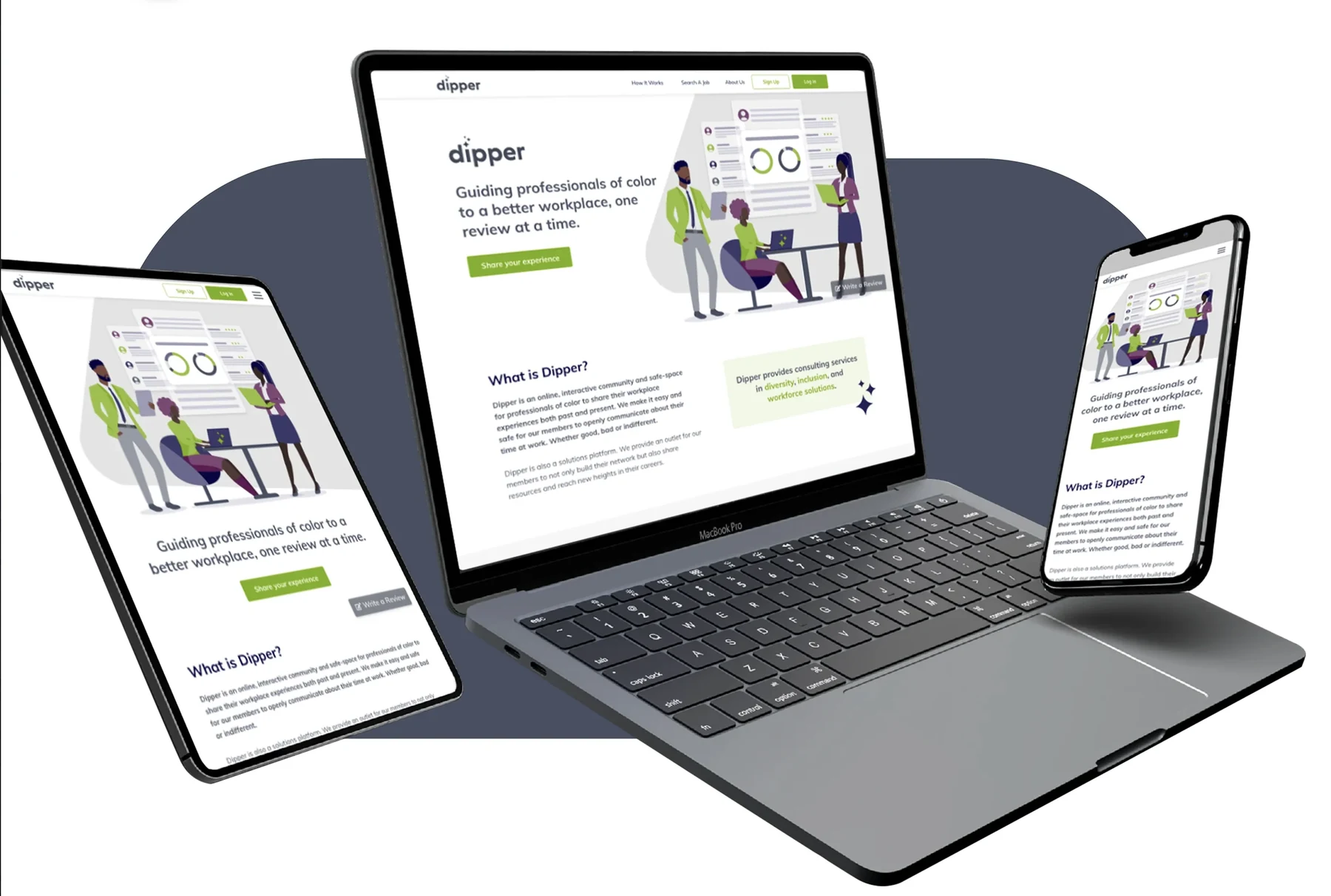
UX/UI product design for a B2B startup marketplace from concept to launch.
Enterprise UX for a global pharmaceutical congress event platform.
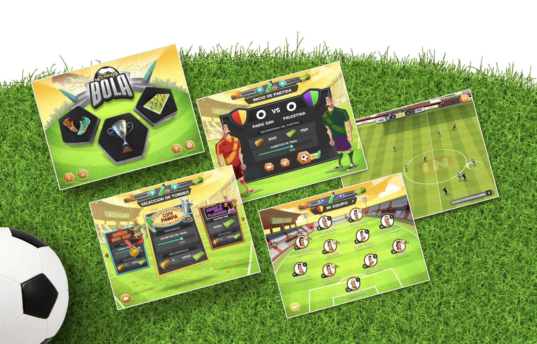
Art direction and UI for Disney & Globant mobile game titles.
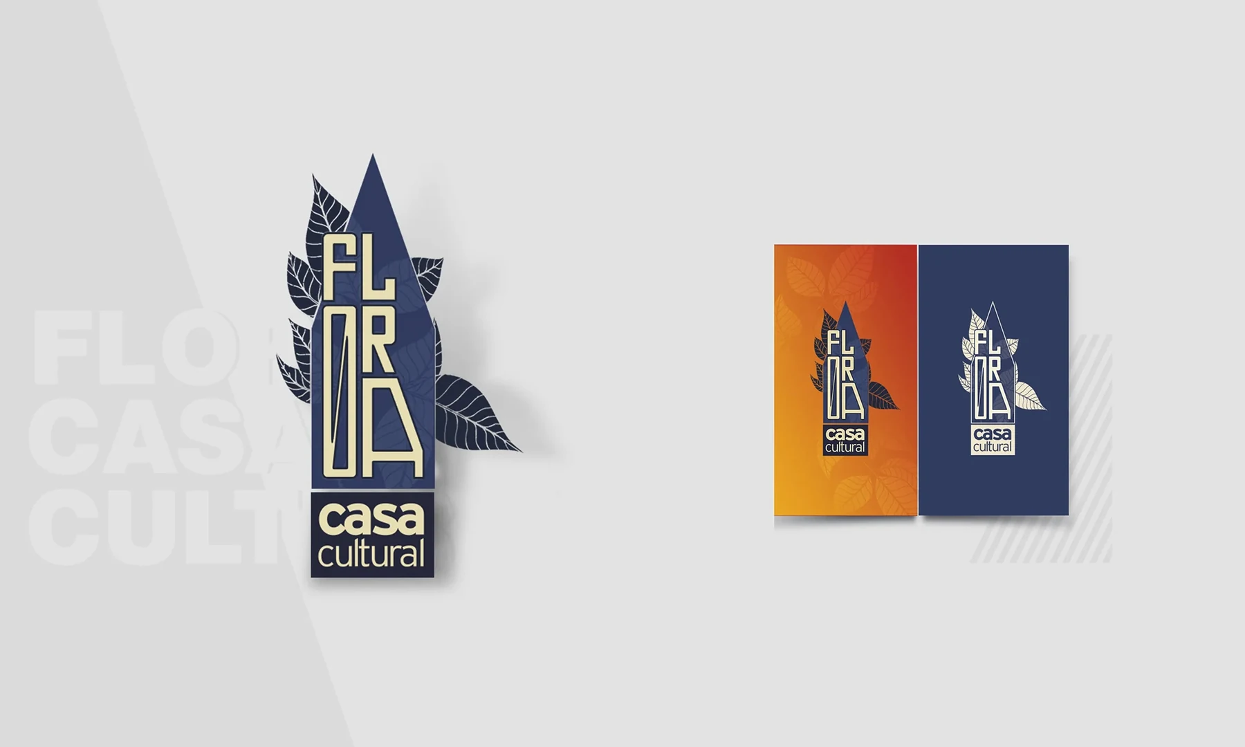
UX and UI work spanning multiple industries — research-driven design.
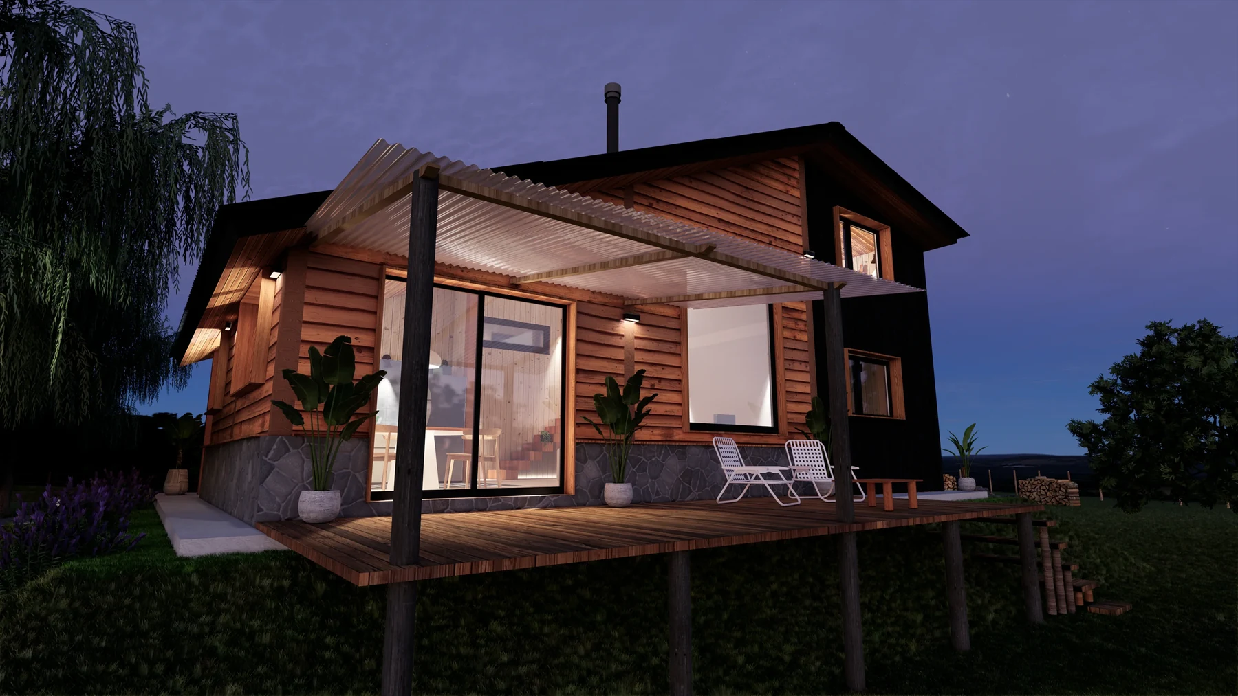
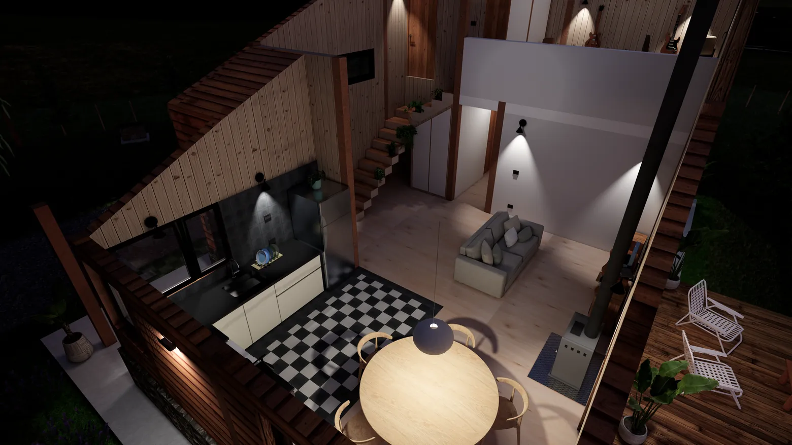
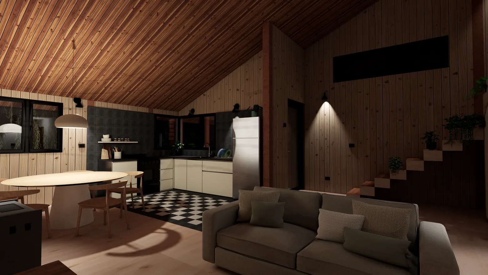
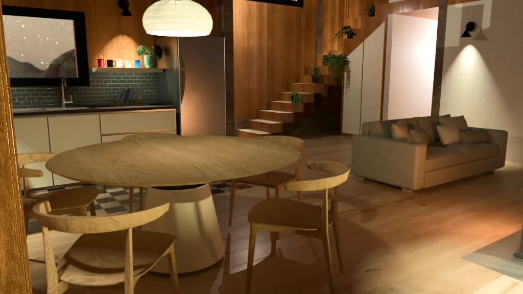
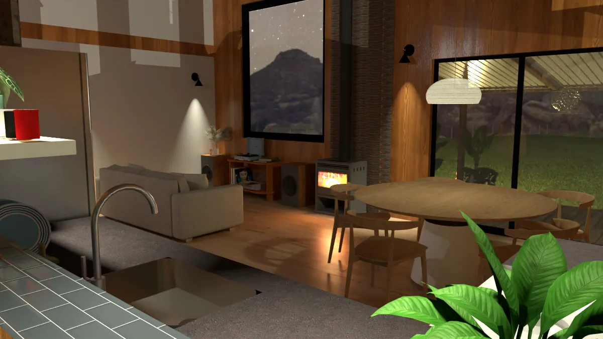
3D architectural modeling and photorealistic rendering in SketchUp.
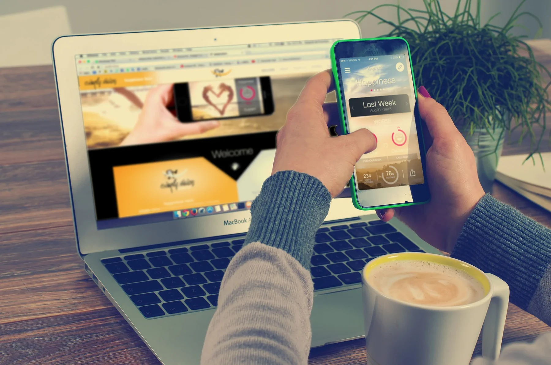
A wellbeing app that turns daily check-ins into insight — UX, UI & project lead.
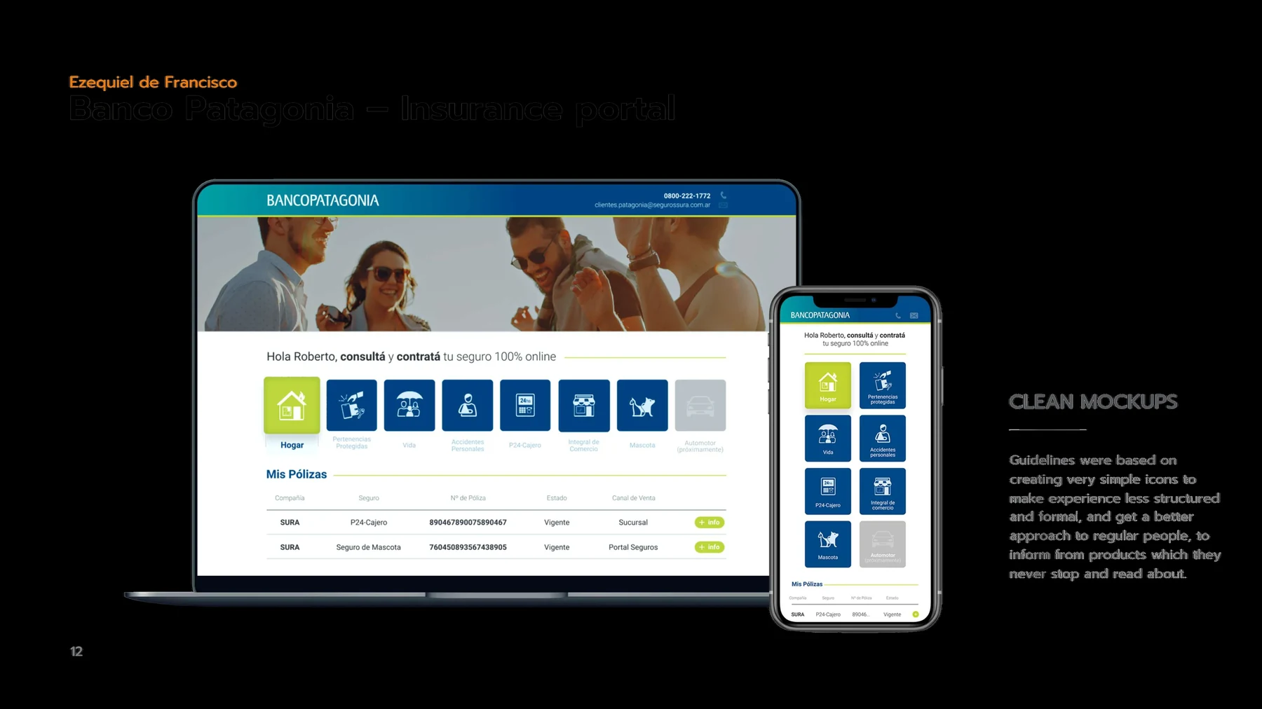
A 100% online insurance portal that makes buying cover simple and human.
Available for freelance and full-time remote opportunities in Product Design and WEB3.
Ready to start a project?
Send an email and I'll reply within 24 hours.
ezequiel.defrancisco@gmail.comLead Product Designer responsible for the full
end-to-end design of a Web3 gaming marketplace.
Open Loot is a crypto-gaming marketplace built by Big Time Studios — the infrastructure layer for Web3 gaming, enabling players to buy, sell, and trade in-game NFT assets across multiple partner titles.
As sole Lead Product Designer (2022–2026), I owned end-to-end design: from UX strategy and wireframes through UI design, design system, prototyping, and ongoing iteration with engineering.
Scope included:
homepage, marketplace, game discovery, OL Chain explorer, user wallet, token dashboards, onboarding, and responsive mobile layouts.
User flows, information architecture, persona definition (casual player vs. advanced trader), competitive analysis, heuristic evaluation.
Full V2 redesign — new visual language, dark-mode system, component design, brand alignment across all platform surfaces.
Token-based Figma system: color tokens, typography scale, spacing, icon set, component library with all interactive states.
High-fidelity interactive Figma prototypes for stakeholder review, usability testing, and engineering handoff.
Responsive layouts and mobile-first screens for marketplace, game discovery, and onboarding flows.
Figma specs, annotations, edge-case docs. QA of implemented screens, visual regression tracking.
12-COLUMN GRID · 8PX BASE UNIT · 1920 / 1440 / 1024 / 390px
Abstracting blockchain complexity — wallet connection, gas-free transactions, NFT ownership — into familiar gaming UI patterns without losing trustworthiness for crypto-native users.
Presenting NFT items from 6+ games with different art styles, rarity systems, and metadata structures — all within a single cohesive marketplace UI that feels natural to each game's audience.
Operating as the sole designer across the entire product surface required strong prioritization, a robust design system, and tight engineering collaboration to scale output efficiently over 4 years.
Complete redesign and launch of openloot.com V2 — new visual language, improved IA, and a scalable component system deployed to production.
Designed all user-facing surfaces for Open Loot's native blockchain — transaction explorer, token dashboards, and in-platform blockchain activity feeds.
Onboarded and designed for: Big Time, Boss Fighters, World Shards, Reign of Terror, Shatterpoint, and Desolation — each with custom marketplace integration.
Delivered responsive designs across all major breakpoints, enabling the full marketplace and game discovery experience on mobile without a native app.
Built and maintained a Figma design system that scaled from launch through 4 years of product iteration — a single source of truth for the entire UI.
Established a design-to-dev workflow reducing handoff friction, enabling fast concept-to-implementation cycles in a fast-paced Web3 startup environment.


A community and a product for professionals of color
to share what work is really like.
Dipper is an online, interactive community and safe space for professionals of color to share their workplace experiences, past and present. It makes it easy and safe to speak openly about their time at work — whether good, bad, or indifferent.
It is also a solutions platform: members build their network, share resources, and reach new heights in their careers.
We redesigned the landing page from scratch and built a web app where members give clear, concise insights into organizations through thoughtful surveys, alongside a live private chat room for what is happening at work today. Companies can join as premium members and get the data to measure where they stand, where they can improve, and where they already shine.
We designed for two profiles: an individual — a professional of color — and a company. That produced two parallel flows, sharing components where it made sense and diverging where the functionality genuinely differs.
The mobile-first approach forced the content to simplify rather than shrink. What came out is minimalist and fully functional on every device people actually use — not a desktop layout squeezed down.
Prototyping is what confirms the ideas carried by the flows and wireframes actually reach their objective. A prototype simulates a large share of the real functionality at the earliest stage of the project — because static previews are too technical to read, and people cannot judge what they cannot feel.
The dashboard turns individual reviews into something a company can act on — sentiment on culture, management and equity, aggregated and readable at a glance.
A wellbeing app that turns tiny daily check-ins
into a picture of how you actually live.
Every day you log quick check-ins across five parts of life — Sleep, Nutrition, Work, Social and General Mood. Each takes seconds: how much, and how it felt.
The app then reflects it straight back. A Track screen captures the moment; an Analyze screen turns it into a clear, colour-coded result — trends, streaks, personal records and a running happiness index.
So the patterns behind how you feel stop being vague and become something you can actually see, compare and act on.
The whole product speaks one colour language. Each of the six life categories owns a hue; every hue runs down a value scale — from “Great” to “Terrible” — so a screen’s mood is legible before a single word is read, and it stays consistent across tracking, results and charts.
A dense product needed a clear map. The flow charts each mode and stage — track, analyze, friends, records — and studies how quickly a new user reaches the app’s value, with onboarding tuned so the first real insight never feels far away.
Early screens had too many tappable areas competing at once — overlapping taps, scrolls and swipes. Wireframing mapped the gestures and organised them, so every element stays clear and as intuitive as possible.
From the launch splash to World Mode’s country-by-country moods, every screen carries the same warmth — playful where it can be, precise where it counts.
Buying insurance online —
made simple, made human.
Banco Patagonia and SURA wanted a portal where anyone could quote and buy insurance — home, life, pet, personal accident and more — 100% online.
Insurance is famously tedious: dense policies, endless forms, jargon people never stop to read. The brief was to make it feel light.
So we built a guided experience that leads people step by step, keeps the focus on benefits instead of paperwork, and works as comfortably on a phone as on a desktop.
The bank’s teal-to-blue identity anchors trust; a bright lime accent keeps it approachable. On top, a set of simple, rounded product icons makes each type of cover instantly legible — less structured and formal, closer to everyday people.
The whole journey was mapped as a single spine — from picking a product through to a contracted policy. The branches (home, common, employees) fold back into one shared checkout: select, address, summary, payment, done.
A persistent stepper — construction type, plans, address, summary, payment — tells people exactly where they are and what’s left. Plans sit side by side with only what matters: coverage and price, nothing to decode.
The journey ends where insurance usually begins its paperwork: a plain, reassuring confirmation — you’re insured, here’s your request number — instead of a maze of PDFs.
The journey ends where insurance usually begins its paperwork: a plain, reassuring confirmation — you’re insured, here’s your request number — instead of a maze of PDFs.
Project developed at Coderio, the agency where I worked, together with a team of developers — the online insurance onboarding for SURA / Banco Patagonia. All rights reserved to Coderio.
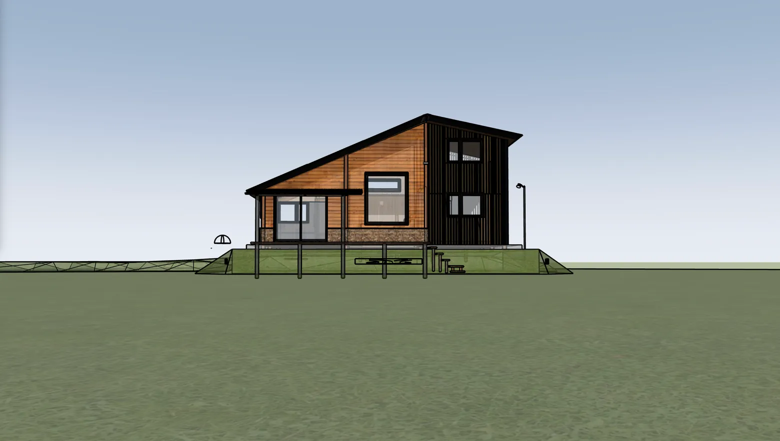
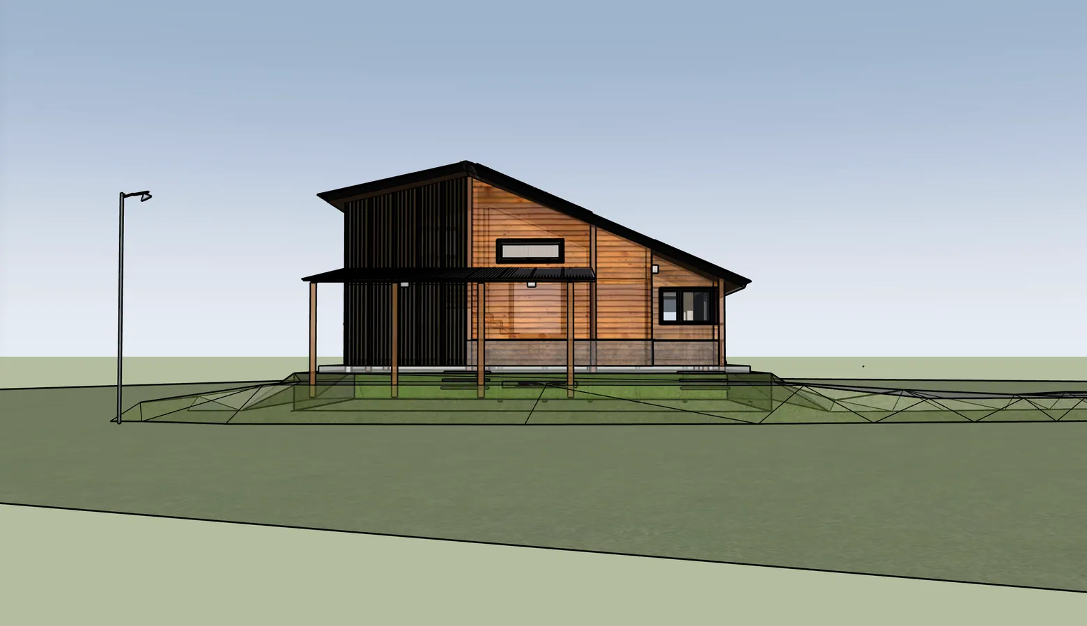
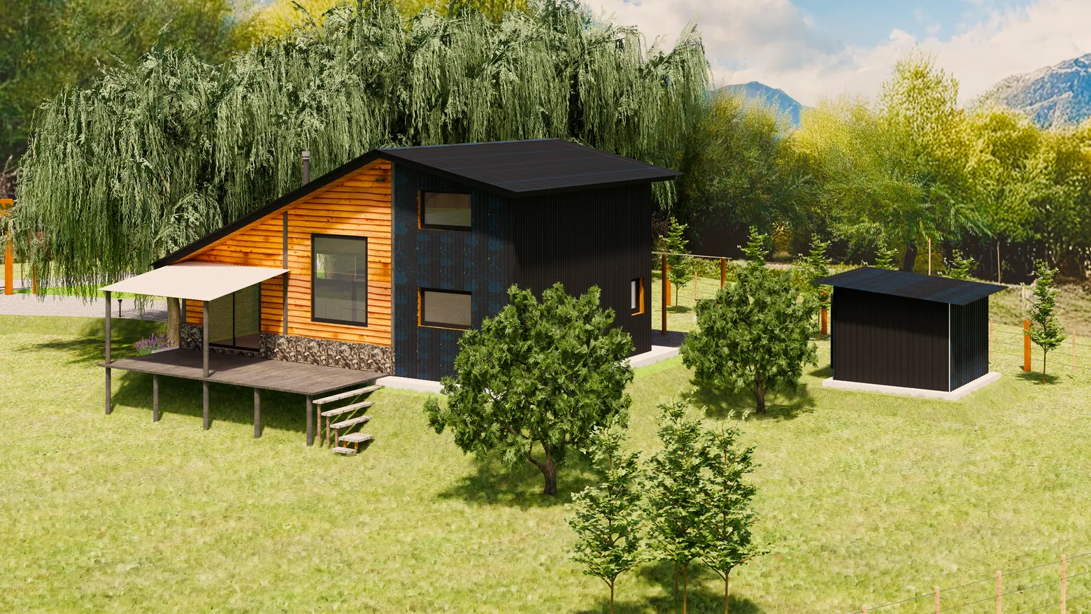
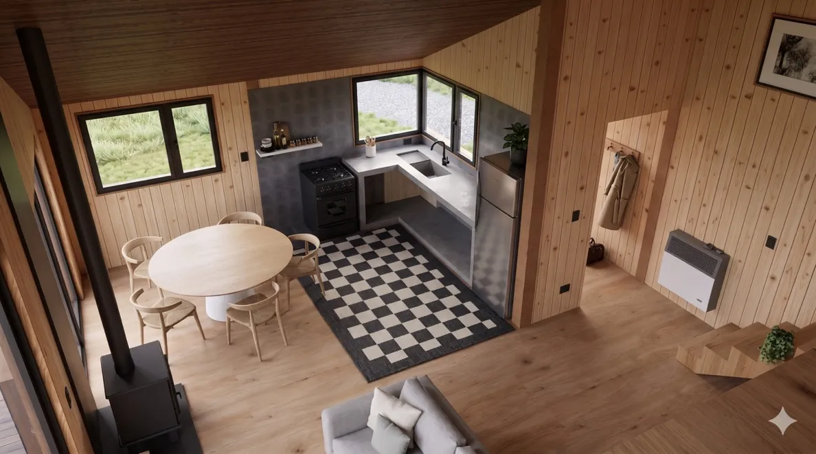
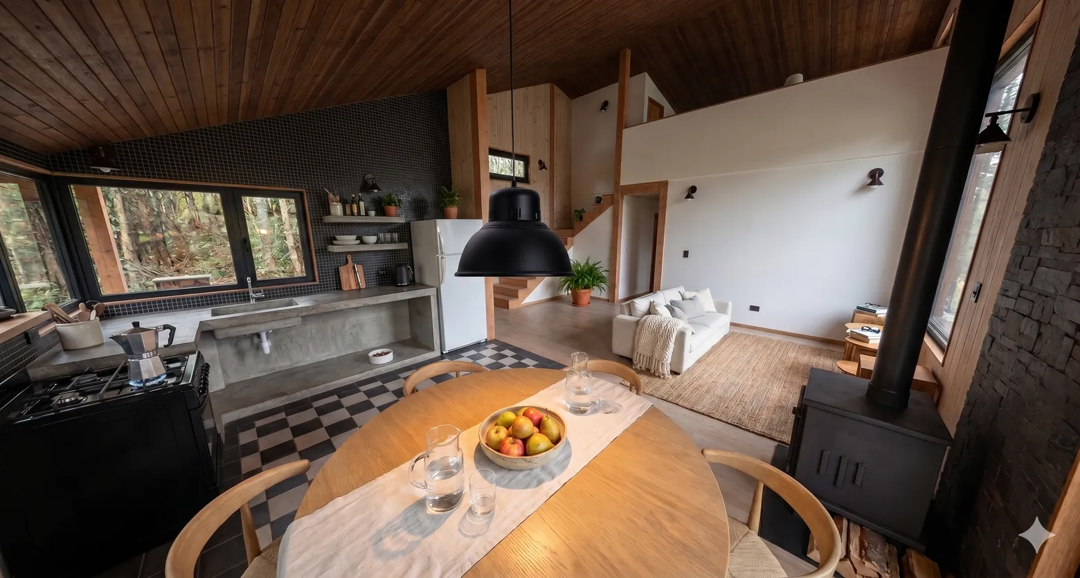
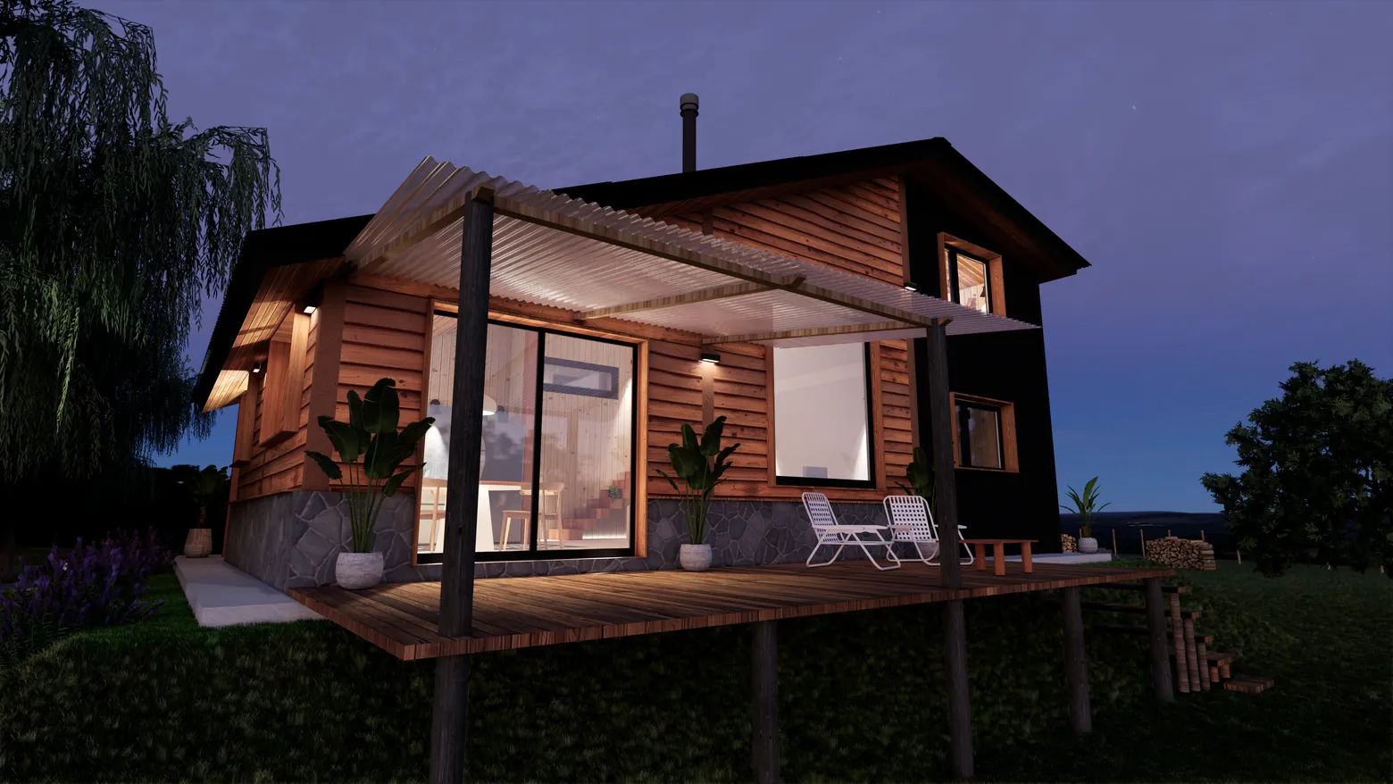
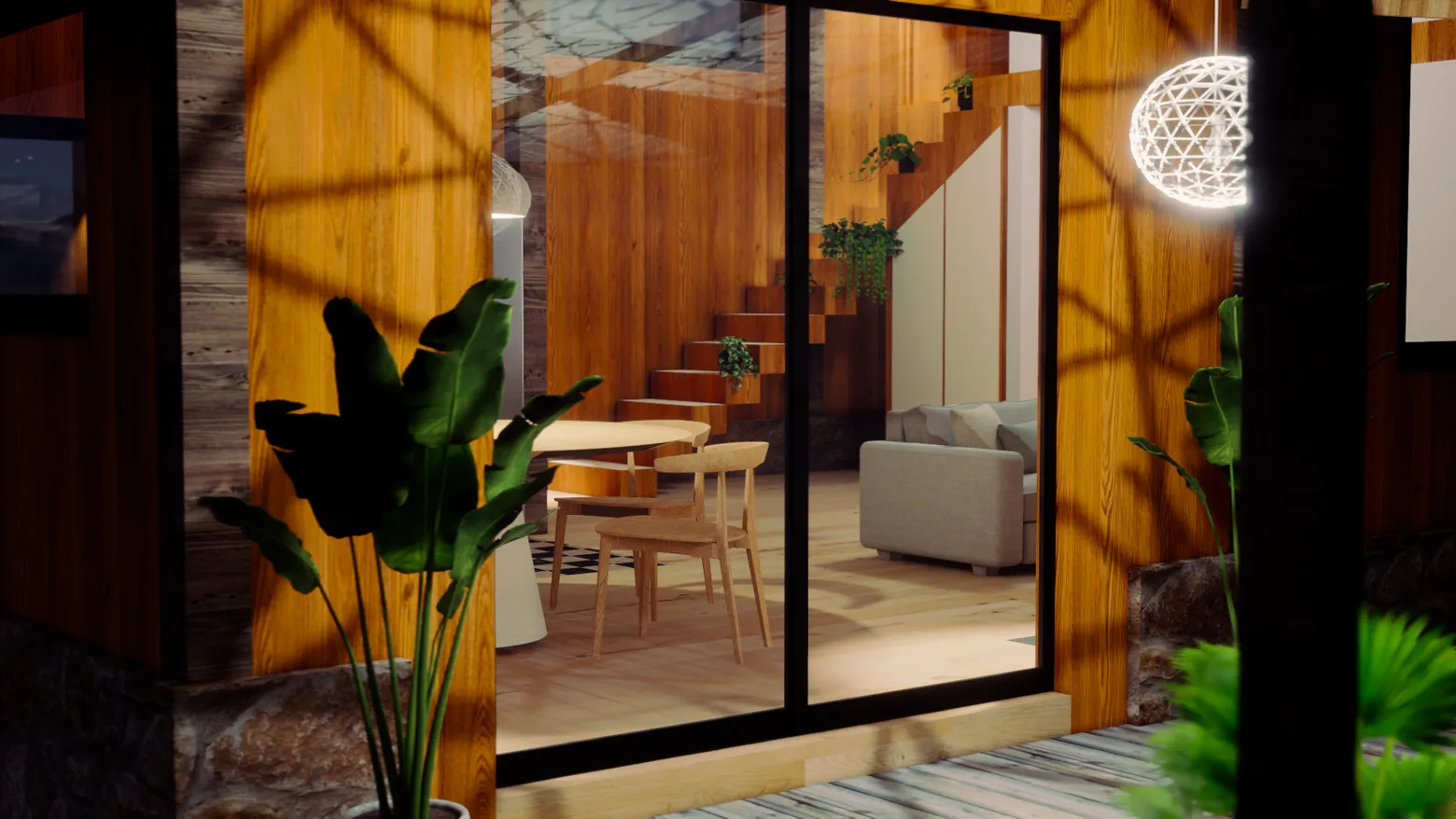
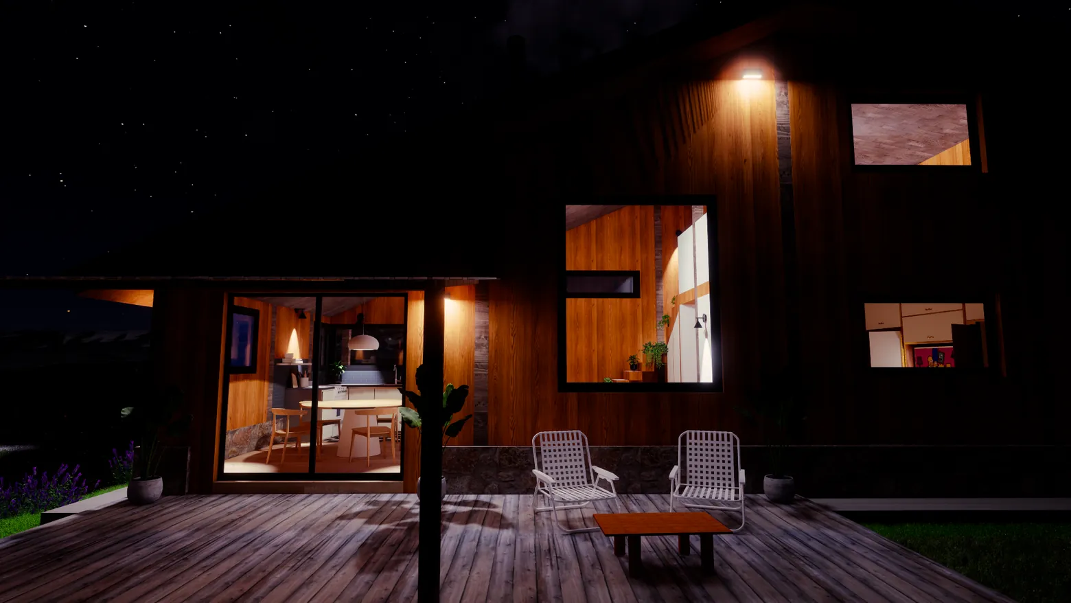
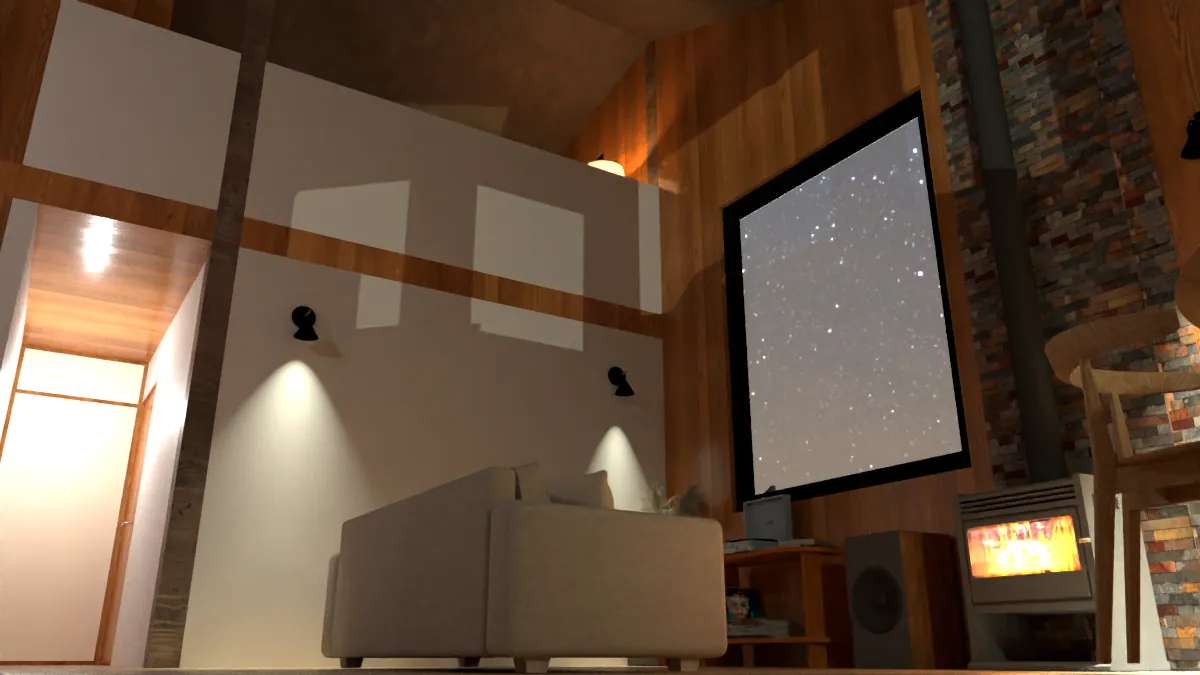
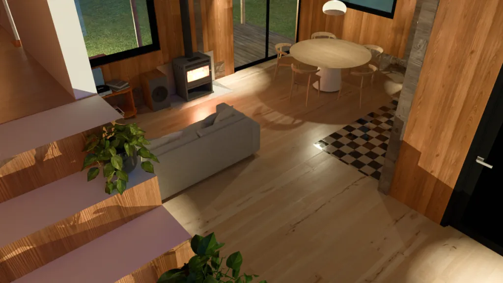
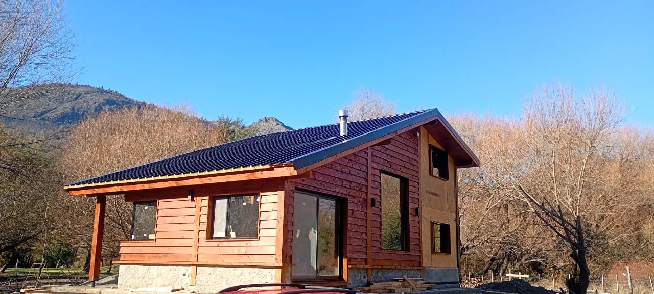
This project explores the integration of a single-family home within the rugged landscape of Patagonia. The primary challenge was to translate the warmth of noble materials—such as wood and stone—into a contemporary architectural language that respects the scale of the surroundings.
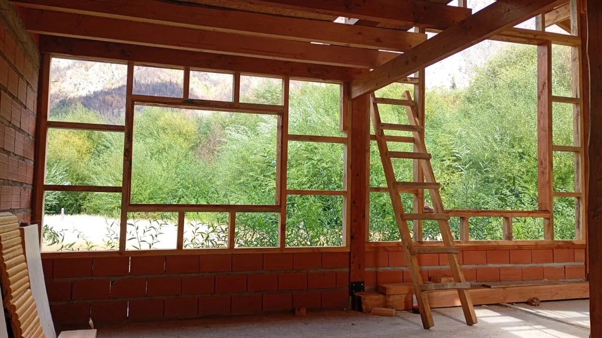
We focused on a simple yet efficient volumetric design, prioritizing natural light intake and panoramic views of the mountain range. This presentation details the technical journey from initial drafting to final construction.
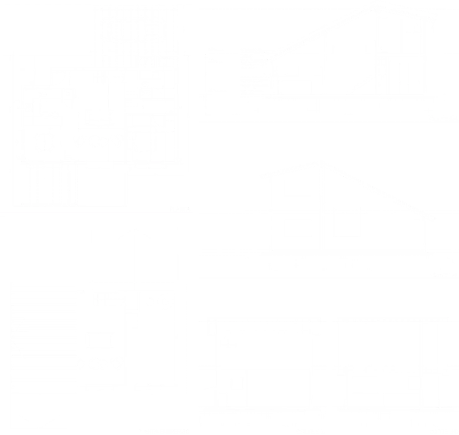
Development of comprehensive technical documentation, including architectural floor plans and longitudinal sections to define internal spatiality. The design utilizes a modular grid system to optimize construction resources in remote geographical locations.
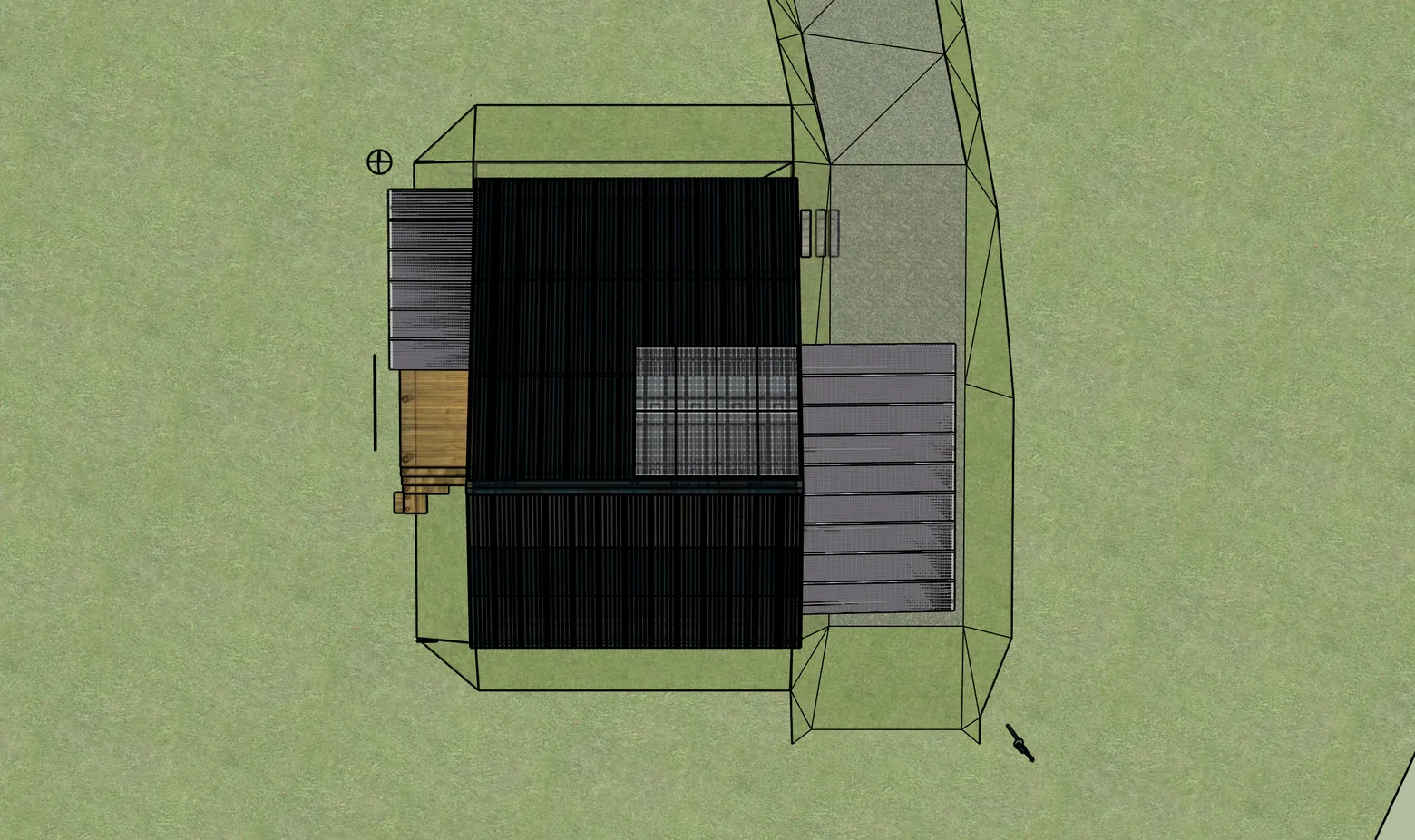
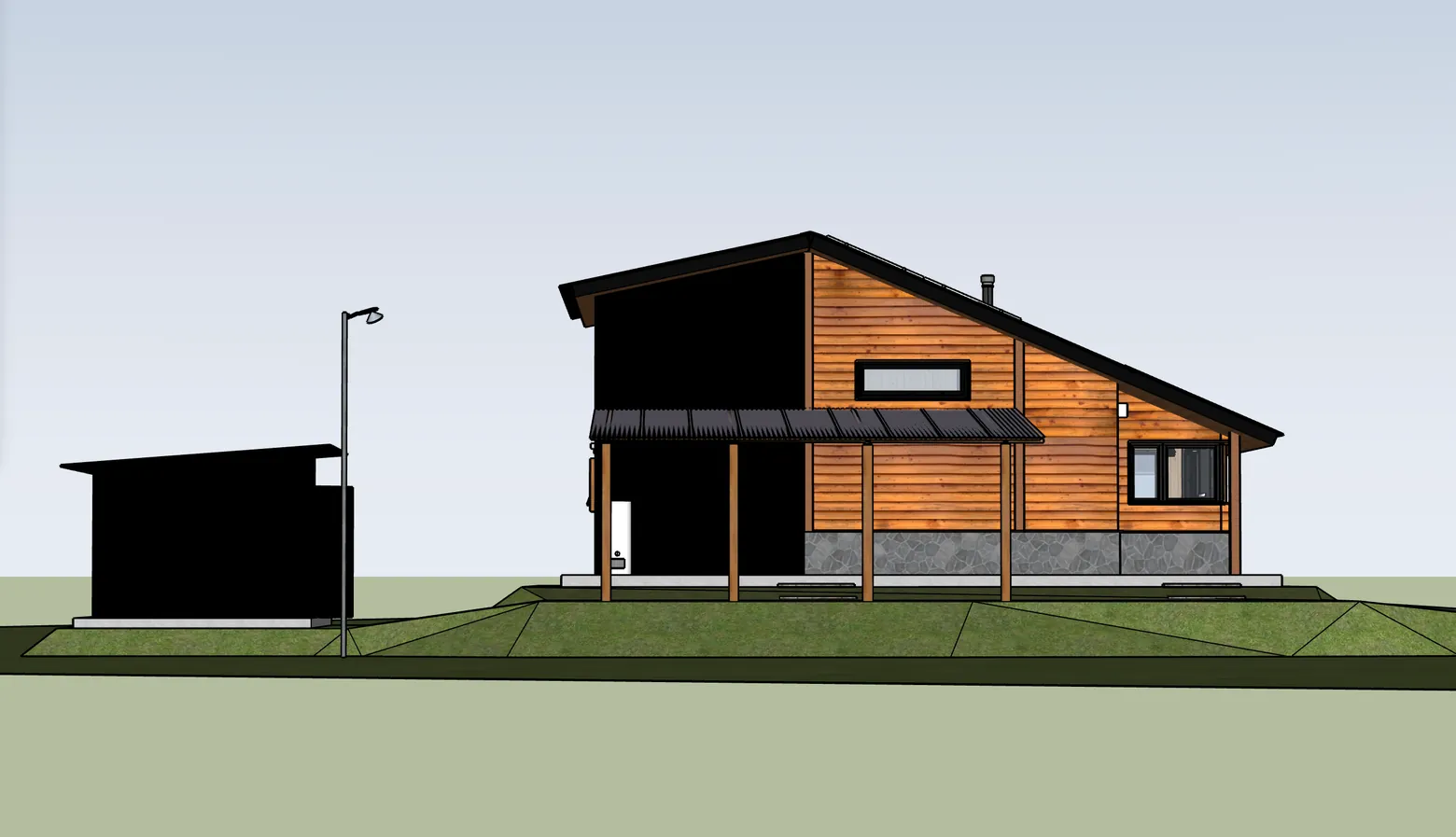
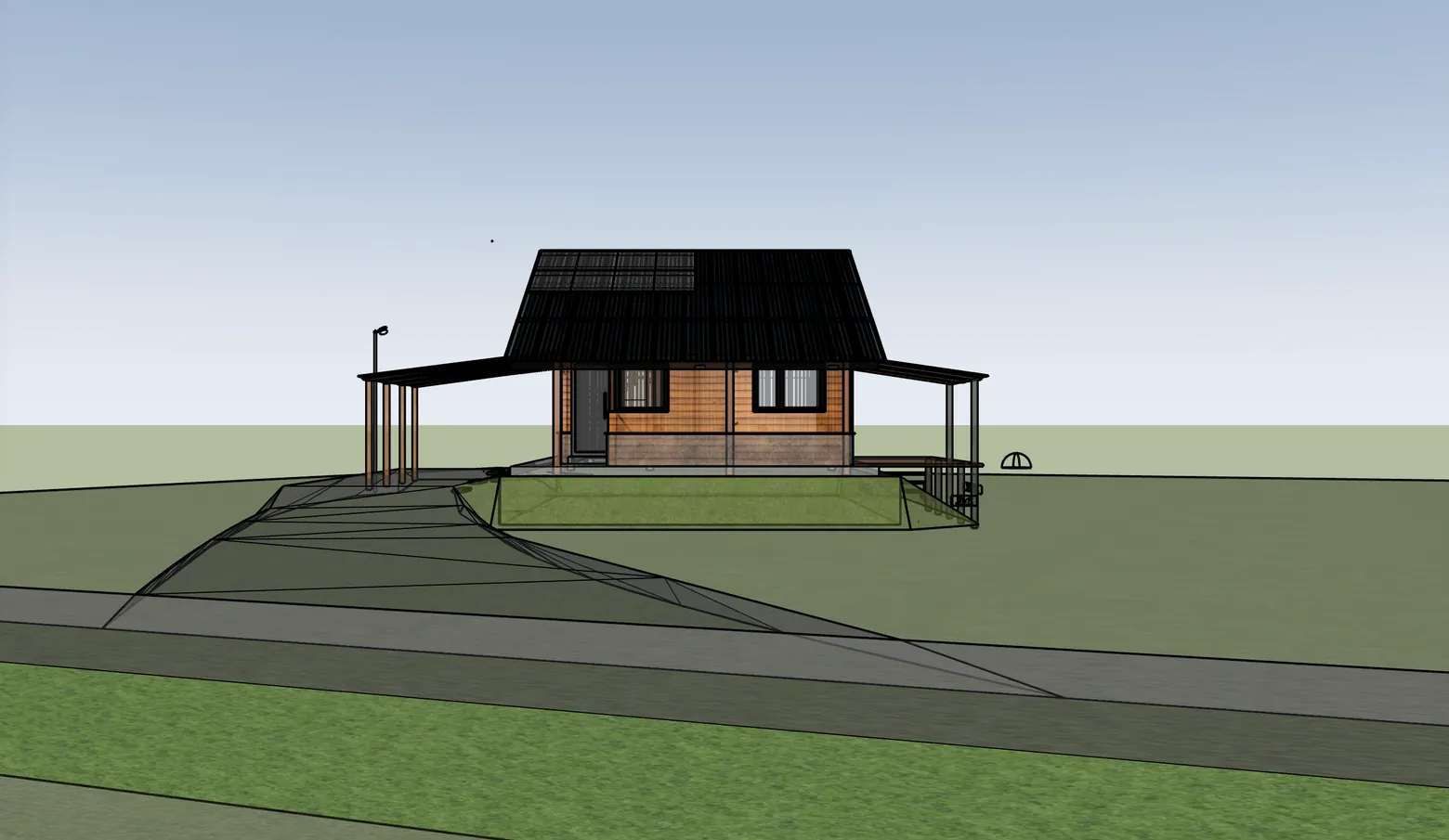
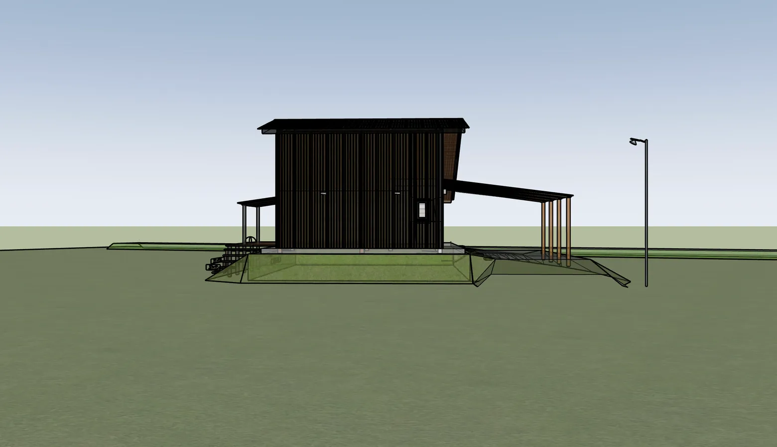
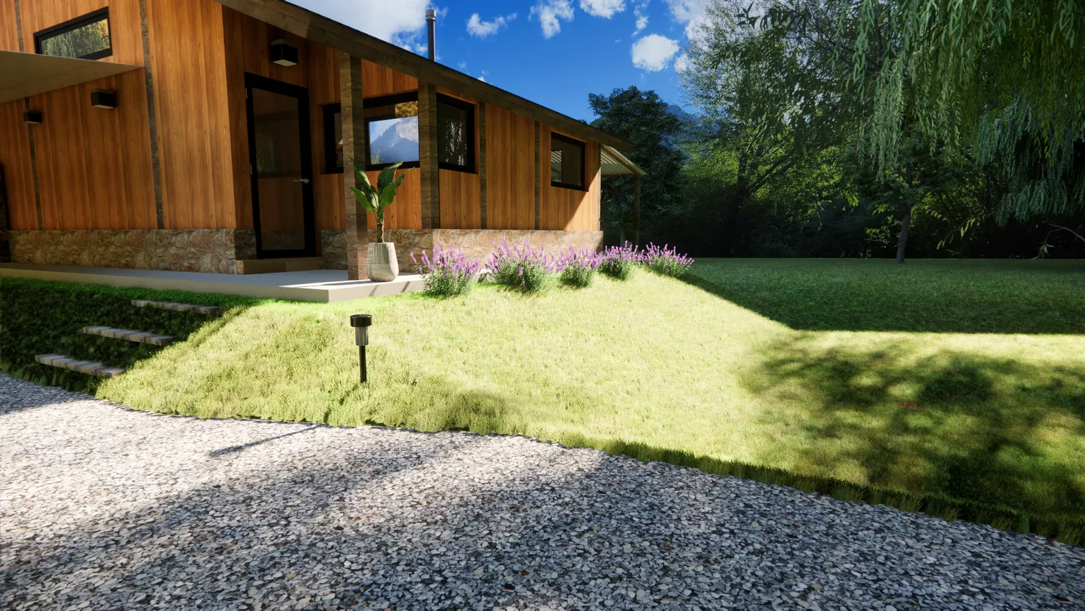
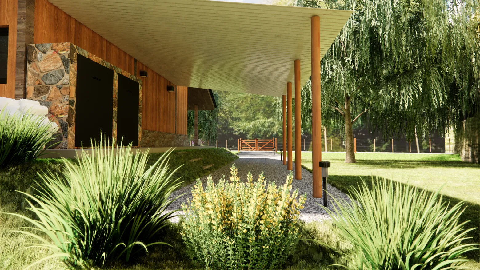
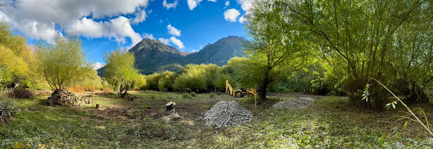
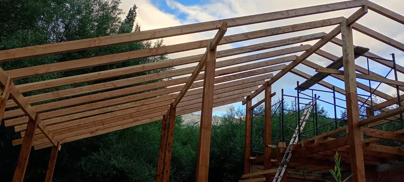
The 3D modeling phase was executed with technical precision, transforming architectural schemes into a detailed digital structure. Special emphasis was placed on the structural accuracy of the timber joints and the site’s topography to ensure a realistic environment.
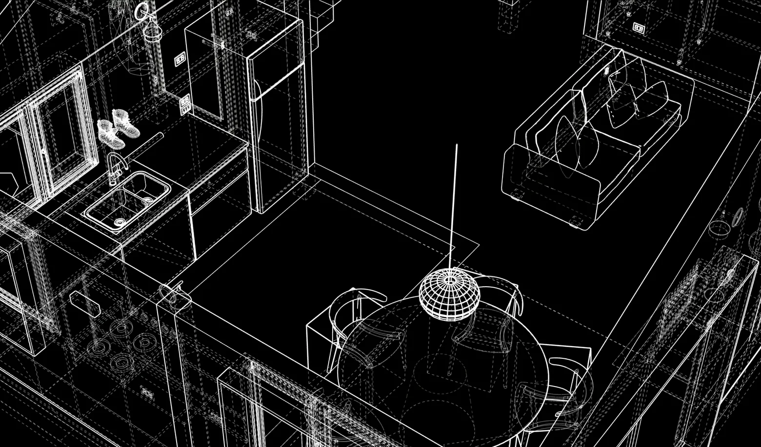
Through wireframes and volumetric models, we validated proportions and solar incidence on the facades, allowing for dynamic adjustments before moving into the texturing and post-processing stages.
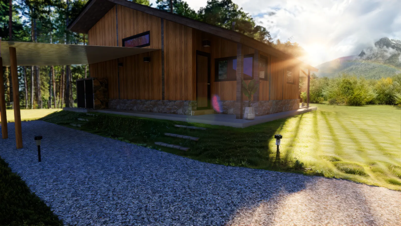
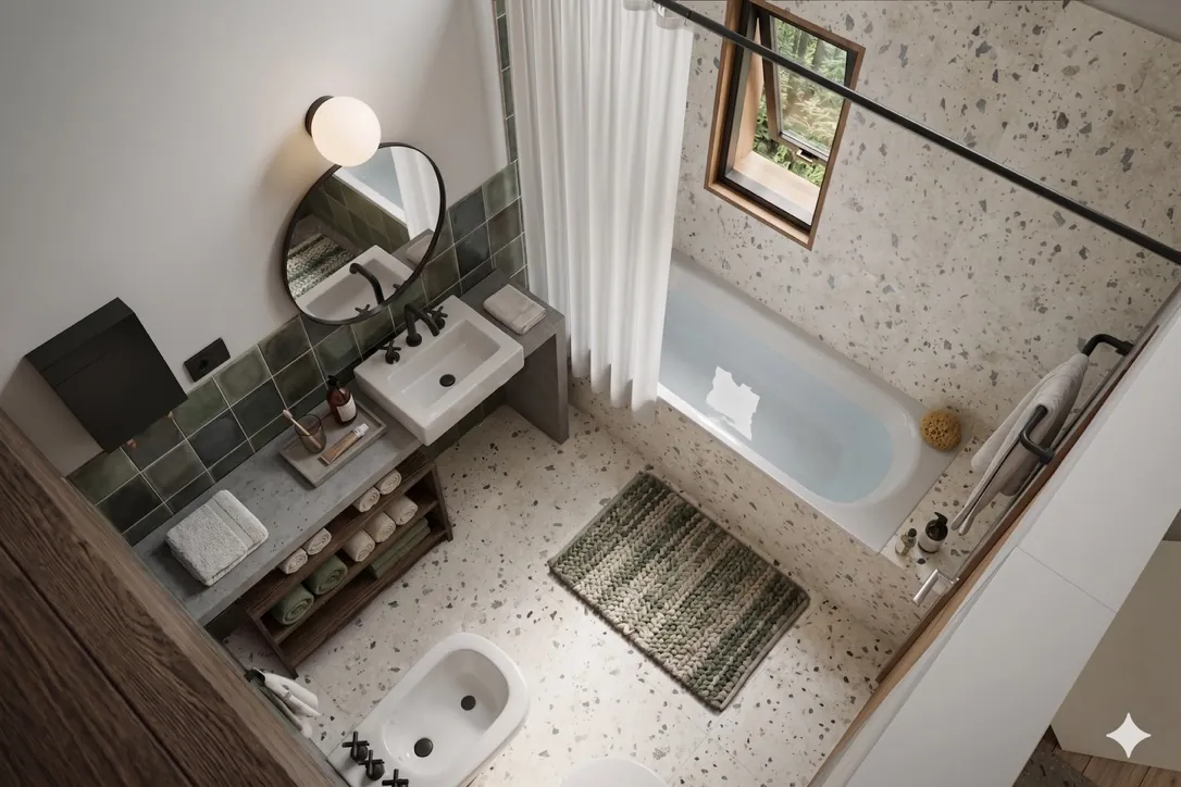
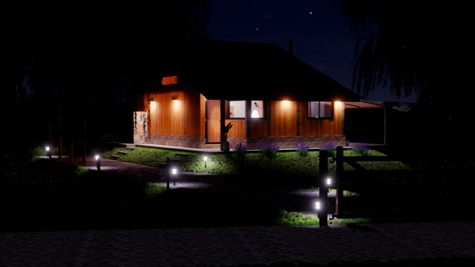
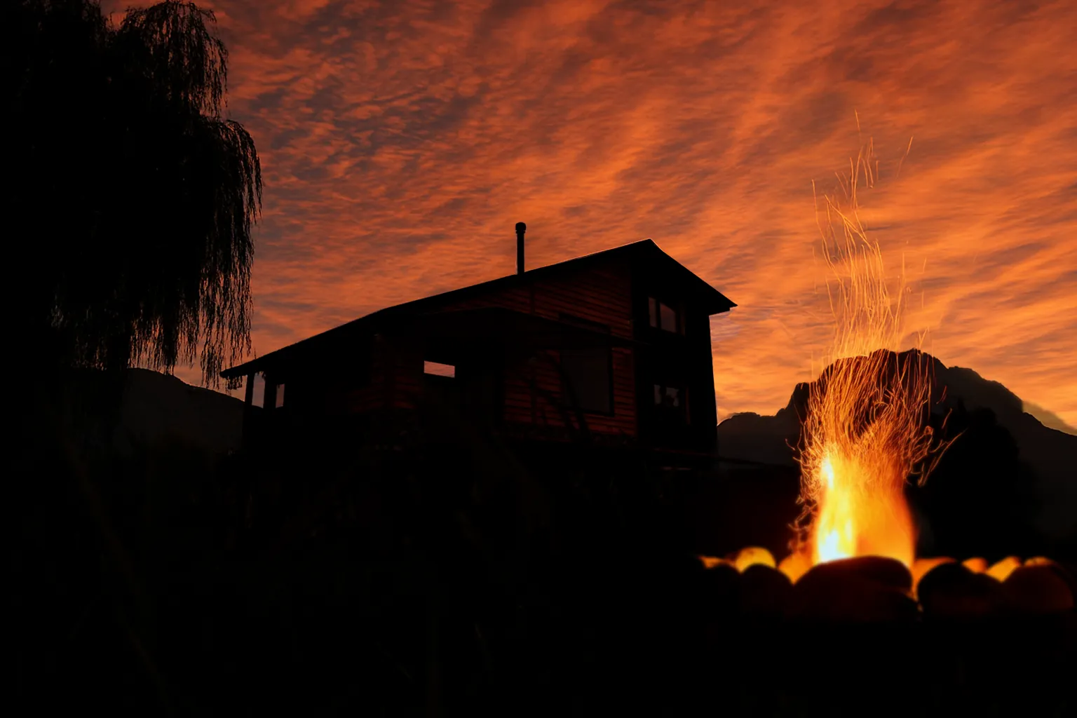
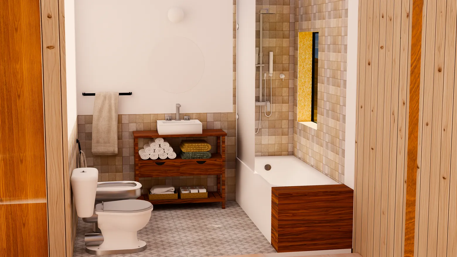
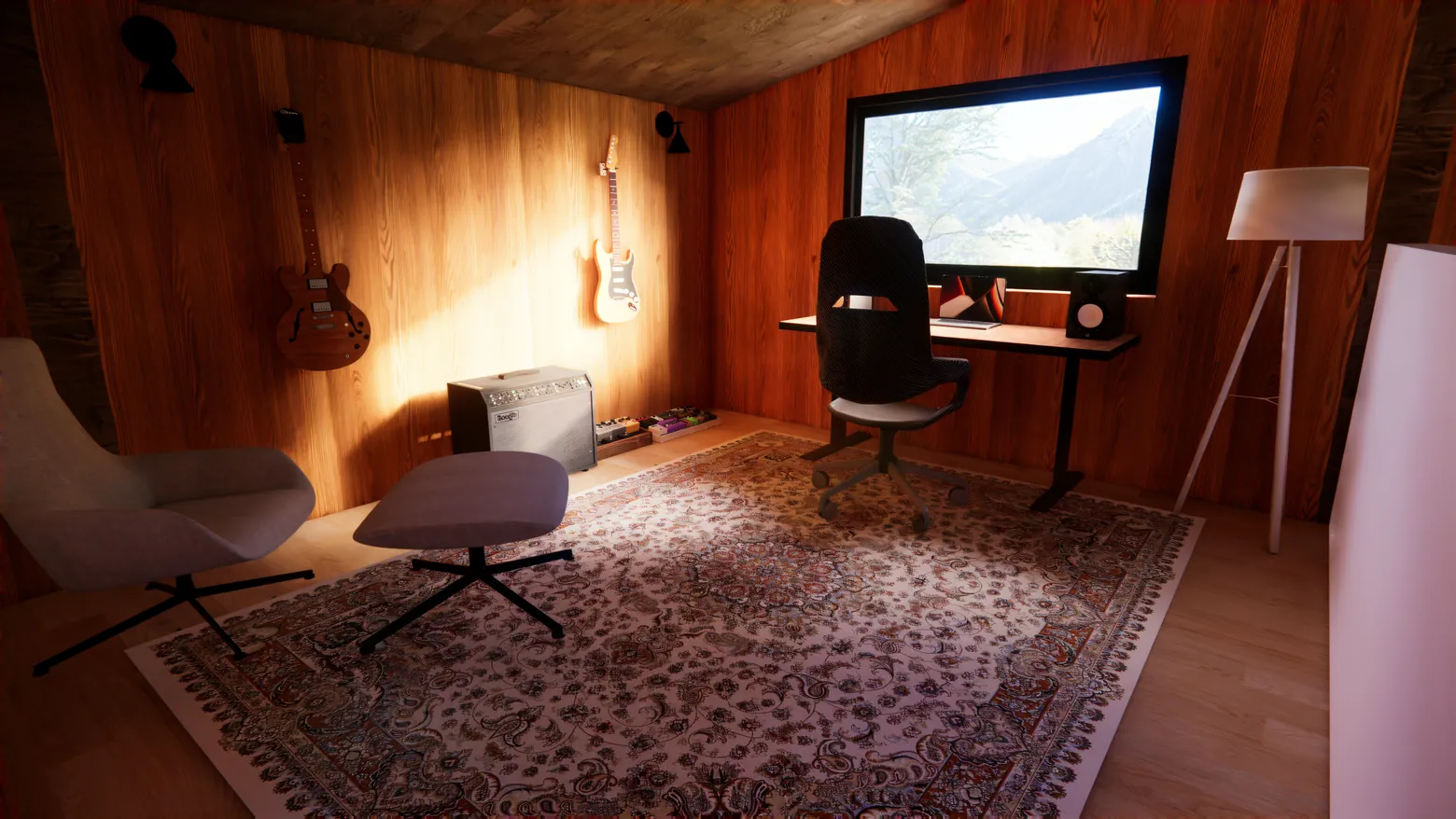
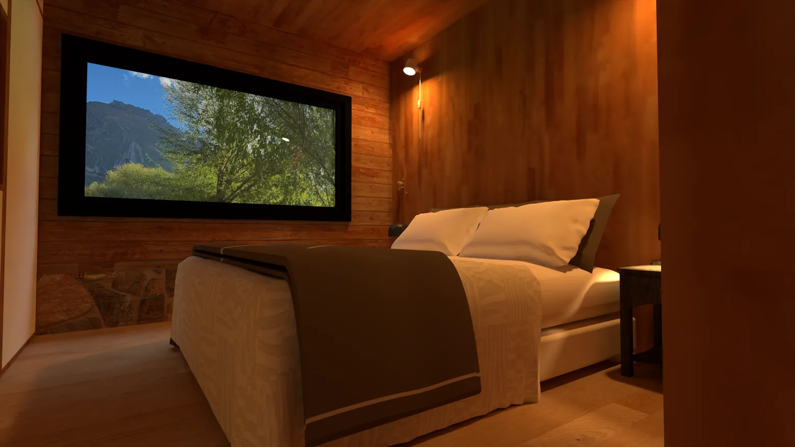
Photorealistic visualization designed to capture the atmosphere of the retreat under various lighting conditions. Global illumination was carefully tuned to highlight natural textures and the contrast between interior warmth and the exterior climate.
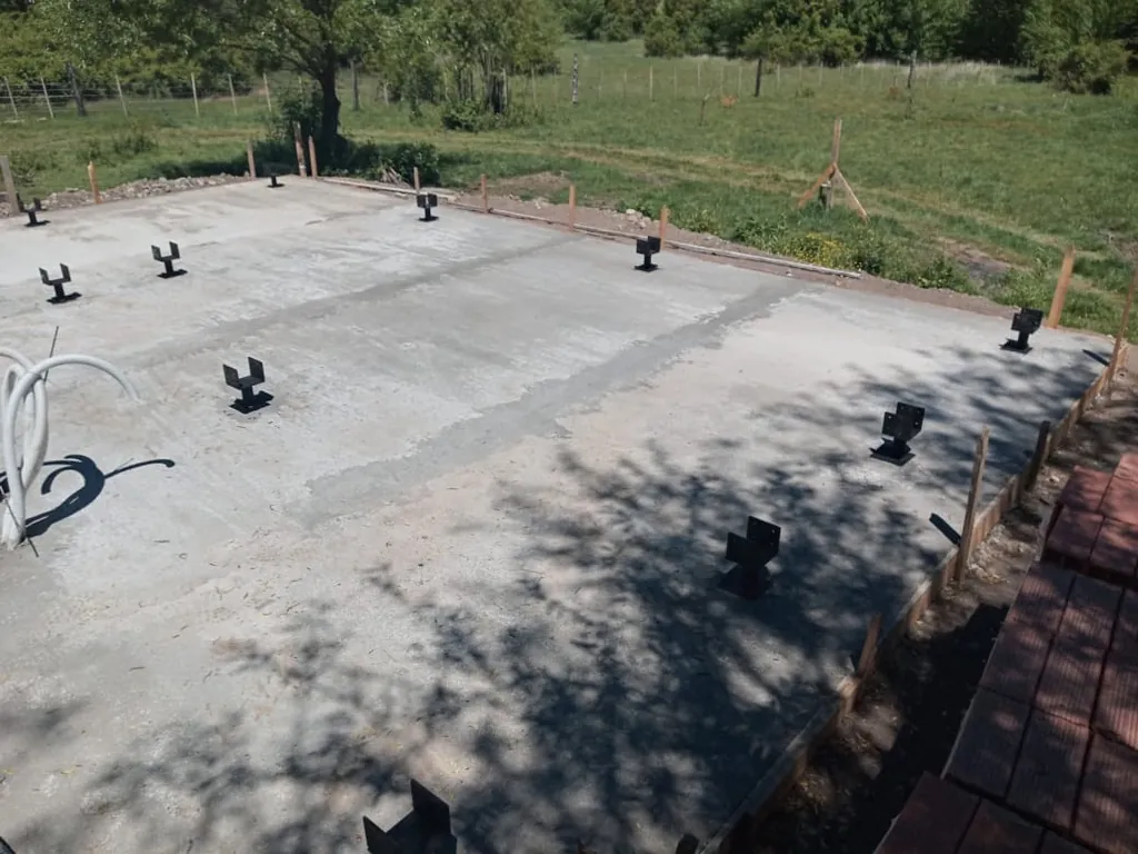
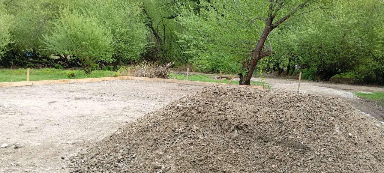
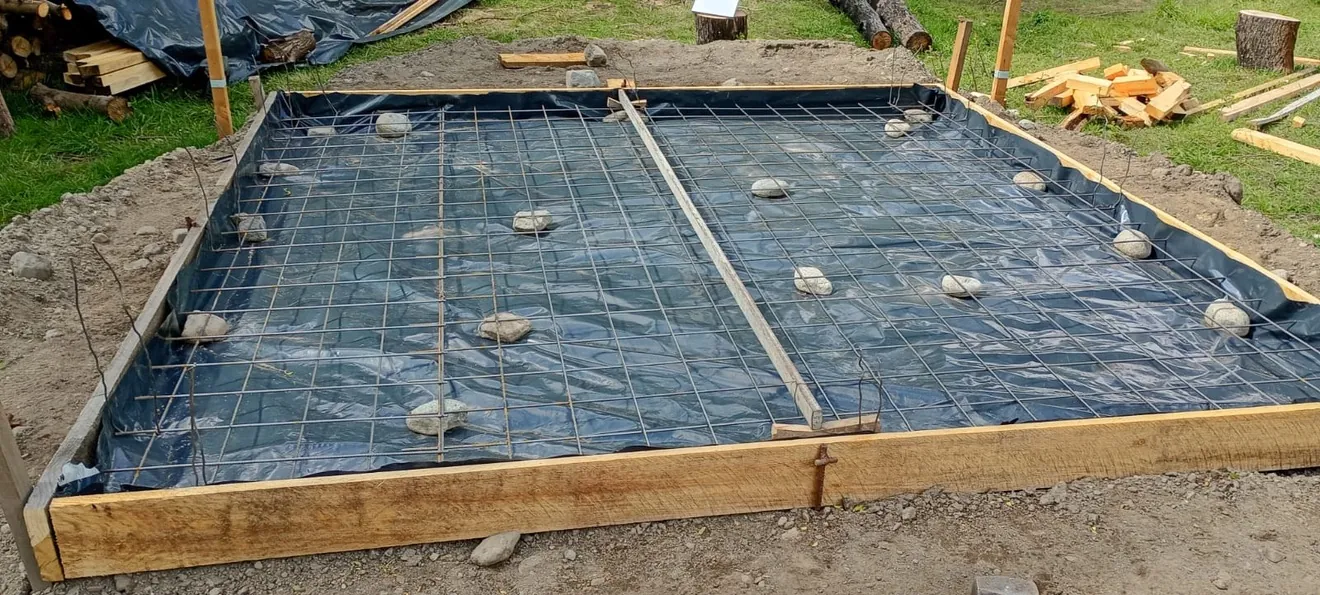
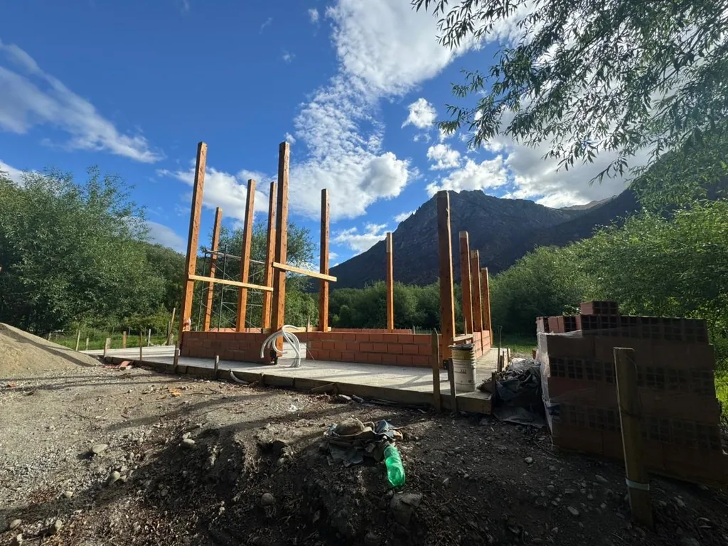
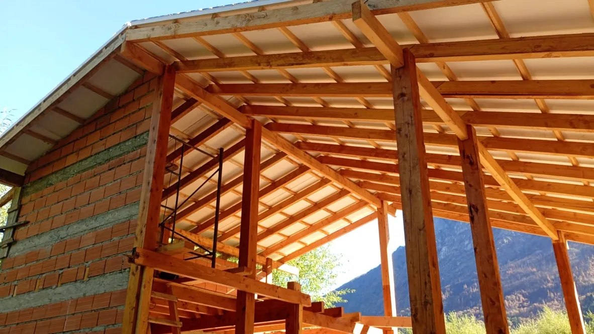
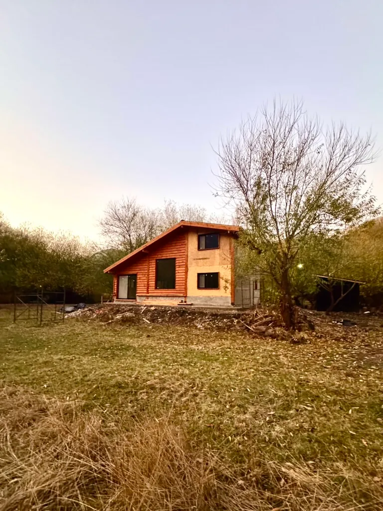
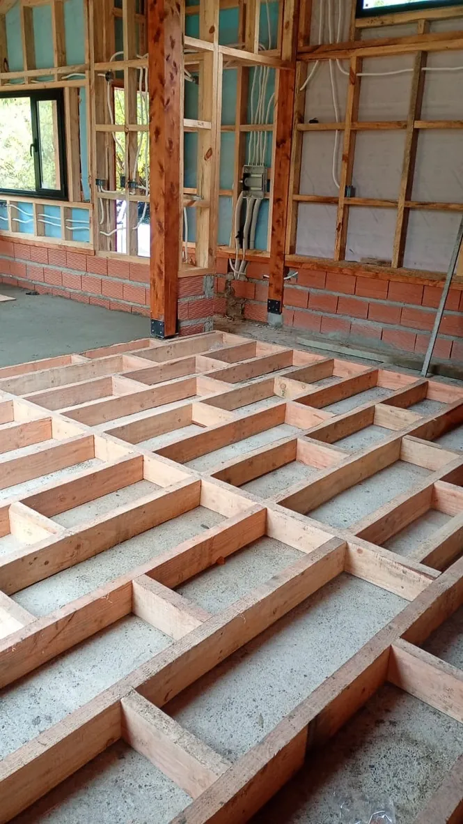
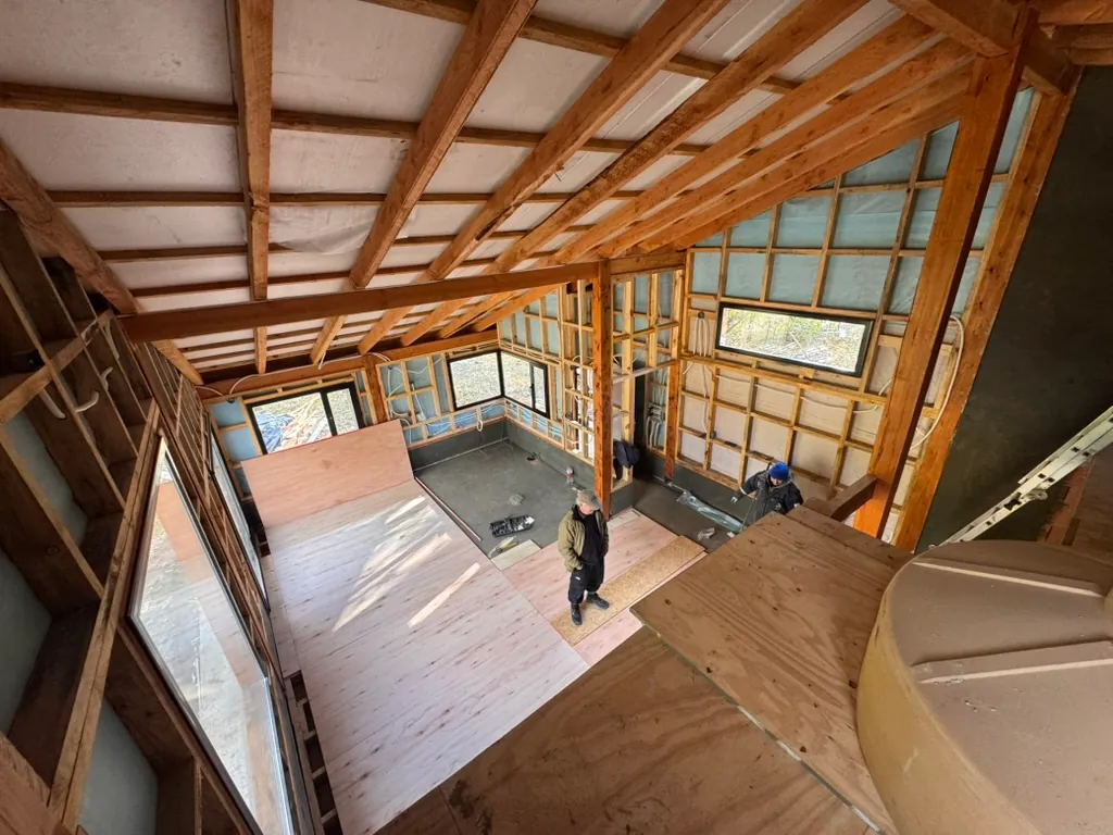
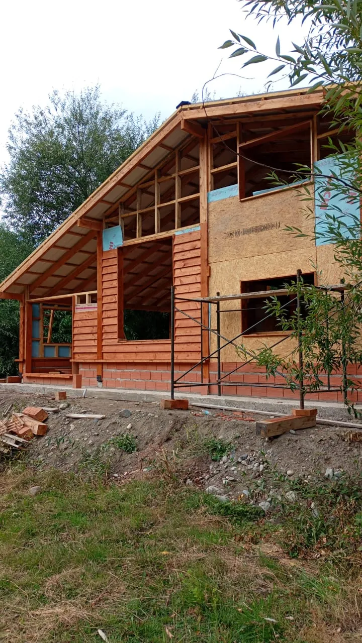
The transition from the digital model to the physical build demonstrates the viability of the proposed design. On-site monitoring allowed us to compare the 3D model’s precision with traditional construction techniques applied in the region.